MONITOR CALIBRATION
The Need To Calibrate:
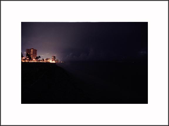
Extended tone photography leaves very little room for viewing error:
nb
What do you see in the scene above? Do you see an extended shoreline descending to the lower right hand corner of the frame? Where does it become invisible on your screen? Do you see the line of clouds running to the right edge of the frame? Do you see the faint lightning in the clouds right at the end? Are you seeing everything you should?
How To Calibrate:
If you do not have a monitor calibrator, you can still calibrate your monitor as well as you know grey and white.
When I was shooting slides as a boy I really enjoyed macro photography. I bought the small letter size Kodak 18% reflectance grey card to take meter reading under unusual circumstances. Camera meters were designed for such a grey value. That card is an example of grey.
For years MacIntosh computers were the defacto of desktop publishing and sported a grey desktop on monochrome monitor. That is pretty much what grey is supposed to look like and the appropriate density for neutral background. If you are serious about seeing accurate colors on screen then you may adopt same. Forget the candy colors that are all the rage. The background influences your perception of whatever you're trying to view on screen.
So, with some idea of what grey looks like, let us begin.
Start with maximum contrast setting and adjust the brightness level so that the black is the "blackness" of your CRT or LCD screen when it's off. Display a black area on screen and turn down the brightness until the tone is the darkest. You won't be able to make it any darker than the color of the screen itself. There is no point in turning the brightness down below this if you want to see all the screen can display.
Now put up an extended white area. Open an empty folder and stretch it to fill, say, the top third of the monitor.
Assuming your monitor has R-G-B drives adjustment, adjust the individual drives until the background looks grey and the white of the empty window looks, well, relatively free of tints. This is not as hard as you think because if it's too green it will look green and when you cross to magenta it will look magenta, etc. Try turning the drive one way and another to hone into the neutral middle. Start with the G drive. Next use the B. Finally tune with the R. Look at both the grey of the desktop and the white of the window background. Do the coarse adjustment with the grey and fine tune with the white.
Voila, you have a well adjusted monitor. The monitor has been adjusted to correctly display grey. From here on you're at the mercy of your monitor's quality. Most monitors are not linear. LCDs tend to have inadequate tonal range. But it's what you've got! So, it's helpful here to check your adjustment with a grey strip or view a familiar image of extended tonal range. Are you seeing everything you're supposed to see? You may have to turn up the brightness level and trade off the deep black to see everything. PC users with monitor gamma of 2.2 versus Mac's 1.8 will have to turn up the brightness level to properly see dark-keyed images done on the Mac.
If you have two monitors or more in a multi-monitor setup the above is a must to match the displays as much as possible. Adjust monitor one first. Then drag enlarge the white window across all monitors. Adjust the second monitor's RGB drives so the grey matches the first along with the brightness (use RGB drives to adjust the brightness leaving similar brightness setting earlier for identical model) and the white is similarly free of tints or of similar cast overall.
It's important to have the large extended white area spanning the monitor(s) as I've never seen a CRT monitor which is perfectly even everywhere. Similarly when you examine the grey area try to take all of the area into consideration.
Tarn Tantikij
TARN Fine Art Photography
Views since - 21 Oct 2002